Flat design has exploded in recent years, thanks to a range of prestigious early adopters that paved the way for the rest of the online stratosphere. In 2014 and beyond, there have been many big name brands that have become swept up in flat digital design. So where did this design trend come from? Is it here to stay? What are the benefits and downsides of flat digital design, and can we use a crystal ball to see where it will all be heading? Without further ado, let’s take a trip down the digital garden path.
What is Flat Design?
Flat design to the uninitiated may conjure up ideas of a bland and lifeless i.e. ‘flat’ seeming design aesthetic. However this isn’t the meaning of the term. Instead it is a style of design that is exciting, fresh and very right now. It’s a style of design where elements use their stylistic characters that give them 3-D appearance. In other words, drop shadows, gradients, textures and another elements that give the design a three-dimensional feel are removed, rendering the design flat.
This can be a wonderful way to express imagery, content and the underlying message without the distraction of three-dimensional design elements. In other words, flat design can cut out the hubris or background noise in digital design, and make it appear more modern. So what’s this opposing dated version of digital design that we’re talking about? Well it’s only fair when discussing flat design that we look at its counterpart.
Rich design is the use of drop shadows, reflections, gradients in digital design, in order to give the appearance of depth and to make the design more tactile. Rich design has the benefit of providing the user with cues about navigability. It demonstrates to the user where elements like buttons or any other clickable links are located.
Although related in some ways to Skeumorphism, Rich Design is a different design creed in itself. While rich design is about making things pop out of the screen or appear more three-dimensional, Skeumorphism is the act of making digital elements appear familiar or like their physical counterparts – a subtle but important difference to remember.
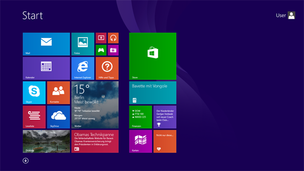
Image Source Windows 8
Flat Design: A History
Flat design hails from an illustrious design and aesthetic pedigree that reaches back to the 1920’s Germany, the Bauhaus, Minimalist and Swiss Design movements. All of these styles overlap and form a unique stylistic blending in the current time.
The Bauhaus School
Anybody who loves design will be familiar with this famous school in Germany that operated between 1919 and 1933. It was responsible for thoroughly modern and streamlined typography and architecture. The influence of Bauhaus has been felt throughout the ensuing decades in everything from furniture design to modern web design.
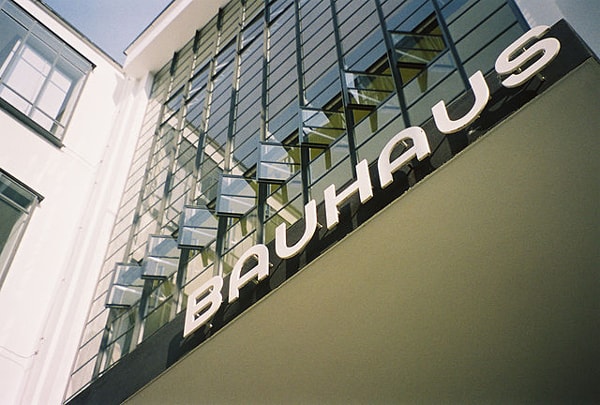
The Bauhaus School, Dessau 2005 Image Source
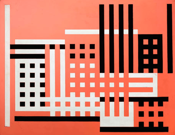
Bauhaus Art Image Source
Swiss Design
Closely related to the Bauhaus School is the Swiss style, also known as the International Typographic Style. This is a dominant design aesthetic from the mid 20th century that originated from Switzerland, and brought Bauhaus, then a more underground and obscure aesthetic, into the mainstream of advertising, art and design.
Swiss design is typified by bold, minimal, sans-serif typography along with a clear hierarchy of content, images and layout. What we can see from this Swiss style in the 40’s and 50’s is generally a large photograph with simple typography and the use of grids.
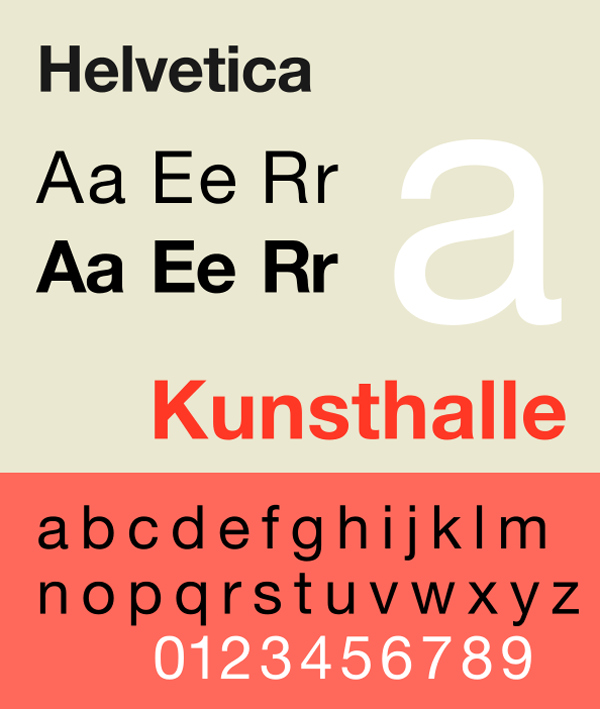
The Swiss design style gave birth to the popularity of Helvetica, designed in 1957. This is a wonderfully simple and elegant typeface, which has also become popular recently during the renaissance of flat design in 2014. Helvetica is popular because of its unique combination of retro nostalgia and futuristic design elements.
Minimalist Design
Minimalism is a term bandied about in web design a lot and has been used interchangeably to describe flat design. However let’s not get confused here. Minimalism is also a historical term that has its roots firmly planted in architecture, interior design, visual art and design.
The basic principles of minimalism dictate that a creator/artist should remove all extraneous elements out of the piece and leave only elements that are necessary. This means geometric shapes, clean lines and bold colour.
Here is a striking examples of minimalism at work:
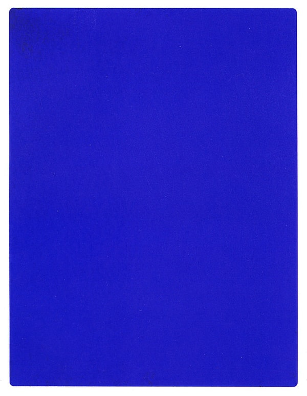
Yves Klein’s The Blue Epoch Image Source
Join us for the next instalment of the Flat Design series where we explore how these retro styles have been resurrected using modern technology, and why their aesthetic appeal is truly timeless.
For well-informed and striking web design that is right on the pulse of the lest trends, speak with Total Web Design today!


