
When Ferdinand Magellan discovered through exploration that the world was spherical not flat in the middle ages, it was considered laughable at the time. Although (surprise, surprise) humans regularly circumnavigate the globe without falling off the edge into a dark abyss. So here’s another idea, albeit a slightly less revolutionary one – that the digital design world isn’t 3-D, it’s flat. We’ve heard previously about some of the granddaddies of design and how they influenced the flat design of the present time. So here’s more about how flat design went from zero to hero in the past year, and what the future holds for it.
Flat design is simply the case of a design trend coming full circle from the 1920’s to the 2010’s. The real trailblazers of the current trend are none other than Microsoft and Apple. The two ubiquitous behemoths have become trailblazers for the flat design trend. This pretty much relegated rich design to the dusty halls of yesteryear overnight.
Microsoft and their Metro Design
The Metro design that we see everywhere in Microsoft nowadays stems from an experimental offering from Microsoft back in 2006 for their Zune media player. This was released as a competitor to the universally popular Apple iPod. The Zune media player had a (back then) completely new and fresh design style that focused on a large lower-case menu type along with background imagery taken from the media player’s own image files. This media player came with a matching desktop software in the same style, for a fully integrated experience.
The Zune media player design evolved later into the Windows Phone aesthetic. The Windows Phone 7 contains this same design element along with large bright, grid-like blocks and simple sans-serif photography.
Microsoft then introduced the Windows 8 operating system with a sleek new look that encompassed bold blocks of content with sharp edges and a range of colour schemes, large lower case sans-serif typography and customised background images. The same basic design aesthetic remained and it’s now used in everything from desktop operating systems to smart phones and their Xbox 360 range. And so Windows gave birth to Metro, a flat design aesthetic that was an instant hit.
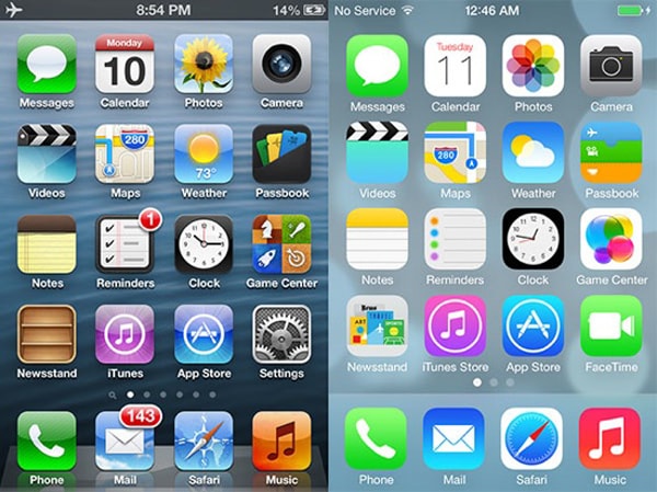
Apple and their iOS 7 design
Apple has long favoured Skeuomorphism. However that all changed with the release of iOS 7 in mid 2013. They now favour flat design for their operating system, sites, smart phones and apps. This hailed the beginning of a new era for Apple’s design aesthetic and meant the end of rich design, which has been considered passé ever since.
Following the release of iOS 7 and Windows 8, many brands got the message that the time had come for a change in the look and feel of their online presence.
The Benefits of Flat Design
Flat design shouldn’t just be seen as simply a fad that will go away soon. This is because it is inherently flexible and removes a lot of the design hubris and white noise around designing for multiple devices.
The simplicity of flat design lends itself more readily to many different devices with small screens and different resolutions. This makes it much easier to customise a web page for a smart phone, tablet and desktop PC without problematic visual changes and glitches. In other words, responsive design for multiple devices is much easier when you’re using flat design aesthetics.
Conversely, when designs rely on textures, drop shadows and fixed imagery they can become problematic for different screen sizes and browser constraints. These added details don’t translate in the same way across all devices and leads to a confusing user experience. When we take away the extraneous elements, this means faster loading times and the content can be shaped and resized a lot easier and quicker using flat design. Faster, crisper and more defined images and flexible content is the net result.
The Downside of Flat Design
Although there are not many downsides to flat design, one aspect is slightly problematic, but not impossible to manage. Flat design makes it hard for a user to distinguish between a button or clickable element on the page.
Although with past user experience under our belts, it seems that we have developed a sense of when something is a clickable element on the page, versus a background element. That’s where using a good designer comes into play.
Looking to the Future of Flat Design
While we don’t have a crystal ball on hand, we can expect that the next new thing will soon burst onto the scene and flat design will become a cultural relic. One promising clue for the future of flat design comes from the other online guru – Google. They have smartly incorporated the best of flat design with some subtle elements of rich design such as bevelled shapes and drop shadows in places to make a unique hybrid style.
As we search for ways to make the online world seem new and fresh. There’s really nothing new under the sun. We can count on the pioneers of Bauhaus, Minimalism and Swiss design for this new phase in digital design.
We hope you’ve enjoyed this trip down the design garden path. Speak with Total Web Design for more inspiring and creative ways to make your business stand out in a crowded room full of voices.
References