To be seen in today’s competitive marketplace, you need a trademark to set your business apart. Enter the logo. Though only a small part of your company branding, it’s one of the most significant as not only does it assist visibility but it tells people who you are, what you do and what you stand for in an instant – well, the good ones do anyway.
If you’re in the process of designing or redesigning yours, here are the five essential principles of great logo design you should stick to ensure it’s a success.
When it comes to logo design, less is definitely more. You only have to look at some of the best-known logos out there – Nike, McDonalds, Twitter – to see that simplicity works. Why does it work? Because when it’s clean and uncomplicated it communicates a clearer and more immediate message. Unfortunately, achieving effective simplicity isn’t easy – it requires some clever creativity.
Tips: Spend time trying to figure out what the main message you want to communicate is. Once you start designing, stick to a couple of elements, strong lines and two to four solid colours.
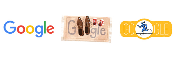
While these logos have become so iconic they now no longer need the company name or tagline – for most businesses its best to still include them.
2. Memorable
If people can’t recall your logo, they won’t remember your brand. Therefore to be effective, your logo needs to stand out from the crowd and make an instant, lasting impression. And what is the key to making an instant lasting impression? Simplicity – refer to number one. In addition, a logo can also be memorable by being different, for example like Google’s ever-changing doodles.
Tips: Make bold colour and design choices which stand out in your industry but are still in line with it. In addition, be unique – never copy another logo, especially a well-known one.
3. Timeless
Your logo also needs to be able to stand the test of time. If it’s not going to sit as comfortably in five years as it does today, you’re going to have to change it and that means potentially losing all the brand associations you have worked hard to build – and confusing your customers.
Tips: Focus on your core message and attributes – whether they are humour, knowledge or heritage – over the latest design trends. These are unlikely to change, so will always remain relevant.

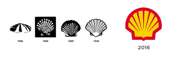
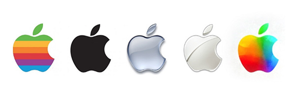
Although these logos have transformed over the years, the changes have been gradual and the basic elements have remained the same.
4. Versatile
Think about all the possible places your logo will be used: your website; social media page; printed brochures; business cards; promotional material like t-shirts and pens; billboard adverts; on photocopied company documents. If it isn’t able to sit on a variety of different colour backgrounds or be reversed or resized without losing its detail, you should reconsider your design.
Tips: Imagine how your logo would look on a white background, a coloured background and sat on top of busy images. In addition, if you blew it up or shrunk it would you lose clarity or detail?
5. Appropriate
This principle covers three core aspects. To be successful your logo should align with each. Firstly, it should be appropriate to your industry – does it sit comfortably alongside competitor logos? Secondly, does it accurately represent your brand? For example, a financial services company would want a more conservative design. Finally, is it audience appropriate – will it appeal to them?
Tips: Do your competitor research – look at what colours, fonts and styles of logo they are using. Also, make sure you test your logo ideas with your target audience to gauge their reaction.
And finally, here are a couple of brands that got it wrong:
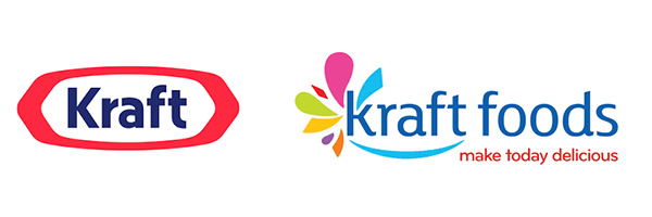
Kraft went from a simplistic two colour design (left) to a multi-coloured busy one (right) which just didn’t have the same clarity, timelessness or versatility – it soon reverted back to one similar to the original.
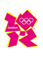
The London 2012 Olympics logo received a very negative reaction from the public. Its problem was that it had too many elements and tried to be too clever. As a result it was misinterpreted by many.
If you need help getting your company logo right, get in touch today.

