
Posted by admin in blog, Web Design, Website Hosting on July 6th, 2014
Flat design has exploded in recent years, thanks to a range of prestigious early adopters that paved the way for the rest of the online stratosphere. In 2014 and beyond, there have been many big name brands that have become swept up in flat digital design. So where did this design trend come from? Is it here to stay? What are the benefits and downsides of flat digital design, and can we use a crystal ball to see where it will all be heading? Without further ado, let’s take a trip down the digital garden path.
What is Flat Design?
Flat design to the uninitiated may conjure up ideas of a bland and lifeless i.e. ‘flat’ seeming design aesthetic. However this isn’t the meaning of the term. Instead it is a style of design that is exciting, fresh and very right now. It’s a style of design where elements use their stylistic characters that give them 3-D appearance. In other words, drop shadows, gradients, textures and another elements that give the design a three-dimensional feel are removed, rendering the design flat.
This can be a wonderful way to express imagery, content and the underlying message without the distraction of three-dimensional design elements. In other words, flat design can cut out the hubris or background noise in digital design, and make it appear more modern. So what’s this opposing dated version of digital design that we’re talking about? Well it’s only fair when discussing flat design that we look at its counterpart.
Rich design is the use of drop shadows, reflections, gradients in digital design, in order to give the appearance of depth and to make the design more tactile. Rich design has the benefit of providing the user with cues about navigability. It demonstrates to the user where elements like buttons or any other clickable links are located.
Although related in some ways to Skeumorphism, Rich Design is a different design creed in itself. While rich design is about making things pop out of the screen or appear more three-dimensional, Skeumorphism is the act of making digital elements appear familiar or like their physical counterparts – a subtle but important difference to remember.
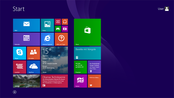
Image Source Windows 8
Flat Design: A History
Flat design hails from an illustrious design and aesthetic pedigree that reaches back to the 1920’s Germany, the Bauhaus, Minimalist and Swiss Design movements. All of these styles overlap and form a unique stylistic blending in the current time.
The Bauhaus School
Anybody who loves design will be familiar with this famous school in Germany that operated between 1919 and 1933. It was responsible for thoroughly modern and streamlined typography and architecture. The influence of Bauhaus has been felt throughout the ensuing decades in everything from furniture design to modern web design.

The Bauhaus School, Dessau 2005 Image Source
Bauhaus Art Image Source
Swiss Design
Closely related to the Bauhaus School is the Swiss style, also known as the International Typographic Style. This is a dominant design aesthetic from the mid 20th century that originated from Switzerland, and brought Bauhaus, then a more underground and obscure aesthetic, into the mainstream of advertising, art and design.
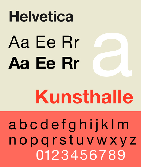
Swiss design is typified by bold, minimal, sans-serif typography along with a clear hierarchy of content, images and layout. What we can see from this Swiss style in the 40’s and 50’s is generally a large photograph with simple typography and the use of grids.
The Swiss design style gave birth to the popularity of Helvetica, designed in 1957. This is a wonderfully simple and elegant typeface, which has also become popular recently during the renaissance of flat design in 2014. Helvetica is popular because of its unique combination of retro nostalgia and futuristic design elements.
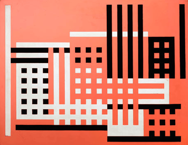
Minimalist Design
Minimalism is a term bandied about in web design a lot and has been used interchangeably to describe flat design. However let’s not get confused here. Minimalism is also a historical term that has its roots firmly planted in architecture, interior design, visual art and design.
The basic principles of minimalism dictate that a creator/artist should remove all extraneous elements out of the piece and leave only elements that are necessary. This means geometric shapes, clean lines and bold colour.
Here is a striking examples of minimalism at work:
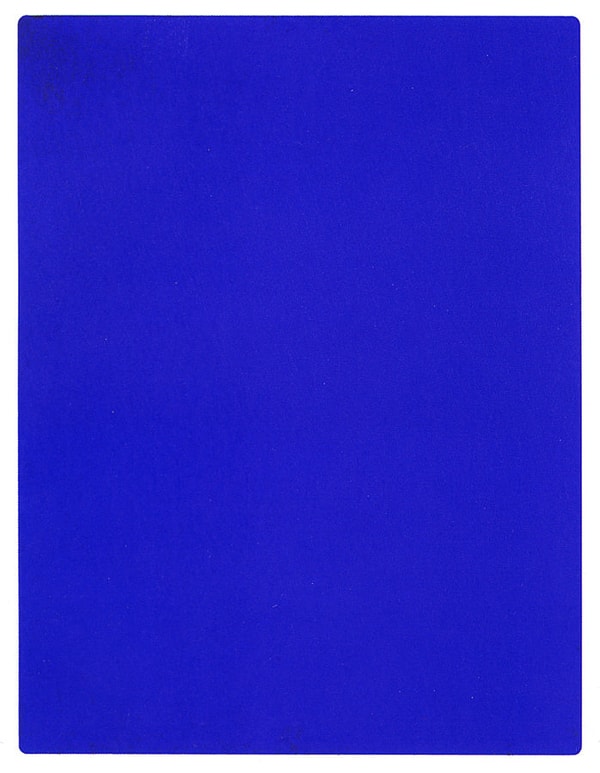
Yves Klein’s The Blue Epoch Image Source
Join us for the next instalment of the Flat Design series where we explore how these retro styles have been resurrected using modern technology, and why their aesthetic appeal is truly timeless.
For well-informed and striking web design that is right on the pulse of the lest trends, speak with Total Web Design today!
Posted by admin in blog, Web Design on March 5th, 2014
Immersive story-telling combines the beauty of great design with the magic of the traditional long-form story. It’s actually been around since the 90’s although with the rapid advances in technology, it’s only now taking off. Take note, because this is a brand new way to engage with your audience!
The Blue Print
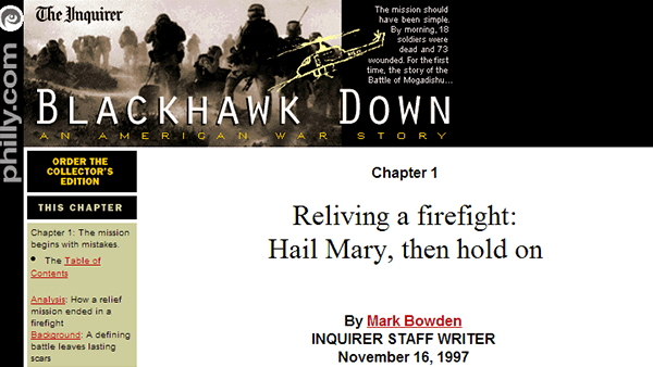
The original immersive story-telling experience comes from the Philadelphia Inquirier, who published a long-form story about the dramatic raid of Mogadishu. This then evolved into a book and then famous movie called Black Hawk Down. The immersive storytelling featured video, audio, maps, links and photos. Amazingly, it’s still available online. Click the photo to see for yourself.
Although it looks a bit shabby by today’s standards (the world of HTML5); it’s actually well put together and does everything it says on the tin.
What is Immersive Story-telling?
Transmedia or immersive storytelling apps engage with the audience in an audiovisual way instead of just via words. Nowadays comics can be converted into transmedia apps along with novels, non-fiction stories, news stories, advertising and even video games. Basically anything with a solid narrative. These stories immerse the reader and make them feel as though they are there. There is a PR element there too. Telling a brand or person’s story through this medium can be a particularly powerful way to reach your core audience. Here are some tools to make the magic happen!
1. Shorthand
The Shorthand app is an elegant new way of presenting long-form text pieces. It allows the producer to highlight areas of text and images, and allows these elements to move along with the reader as she scrolls down the page. There are plans in the pipeline for a free version too. ESPN executed Shorthand well in their piece on The Best of Football in 2013.
2. Zentrick
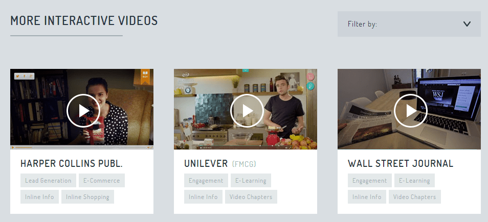
The technology in this app is similar to the previously mentioned WireWAX. Zentrick creates an interactive video by adding links to parts of the video. They also include a browser-based editing facility that allows producers to build interactive elements into the video on the fly. After this it’s possible to share and measure the influence of the video with in-built analytics. Harper Collins, Unilever and Wall Street Journal have all used Zentrick in the past.
3. Metta
Metta adds another layer to the video format. It splices a quiz or questions into a video. This means that it’s easy to create interactive videos like this song lyrics quiz.
4. Popcorn Maker
Is created by Mozilla Firefox and is another browser-based tool. This one allows you to add extra events, images or links to an underlying video or audio file. Popcorn Maker gives producers great flexibility in how they tell their story. In the past, BBC used this app effectively to tell the story of Ian Tomlinson, the newspaper vendor who died during the G20 protests in 2009. The BBC interactive video allowed users to trace Tomlinson through London during the last hours of his life. Check it out for yourself!
We hope that you’ve found this article about immersive story-telling inspiring. And that you’ve gained fresh ideas for your online marketing strategy. For more ideas, speak with Total Web Design today!
References
http://econsultancy.com/blog/63861-12-wonderful-examples-of-immersive-online-storytelling
http://www.digitalpubbing.com/immersive-storytelling/
http://www.journalism.co.uk/news/9-tools-for-journalists-to-produce-immersive-stories/s2/a554425/
Posted by admin in blog, Web Design on December 12th, 2013
Isn’t it annoying when you are looking for something on a website and you are confused by misplaced icons? You keep trawling the website and end up disappointed. The simple reason is bad web design. The process of creating a responsive navigation website includes many factors. However design is the first and foremost one. A beautifully designed website is eye candy for visitors.

The hardest part of web designing is grabbing users’ attention and building a site in such a way that they want to return and keep coming back. Colours, contrast, visual elements and overall balance of design are all important. Moreover, content also matters. The main goal of a website is to provide engaging and well-thought out information.
While designing an e-commerce website, a designer must ensure that the site is user-friendly. The saying “what is visible, sells
Posted by admin in blog, Web Design on December 9th, 2013
Designing websites is a creative job that requires the constant refreshing of skills in accordance with the progress of technology, and the changing tastes of customers.
Innovative designers must have excellent technical skills, along with appropriate knowledge of content and development too. The quality of the work should reflect an ability to grasp the client’s requirements, as well as the goals for the project.

For the simple design of a website, one needs to have a basic knowledge of HTML and CSS. However when one works on a more advanced scale, one needs to understand a wide variety of modules, and have proficiency in programming languages like JAVA, ASP .NET, PHP and more.
A designer from Total Web Design can create more than just e-commerce sites. We can create an online ticketing system for diverse sectors such as logistics, online banking, gaming, advertising and promotions.
The top-notch designers at Total Web Design know the vital points to bear in mind while creating websites:
With the assistance of Total Web Design and our pre-made website templates, we can tailor our range of products to your business needs. Not only that, we can develop sites that are compatible with desktop, mobile and tablet devices. We can also assist with creating an innovative online marketing strategy that enables you to dominate your industry.
Total Web Design are one of Australia’s most well-loved and respected web design firms and provide for our clients online marketing strategies, SEO and web design in Sydney and all across Australia. Contact us today to get a free quote.
Posted by admin in blog, Web Design on November 28th, 2013
Every business, big or small, has the opportunity to go global nowadays; all thanks to the online world. The virtual world is flooded with information on almost everything and allows your business much required global exposure. With massive online competition, it’s essential that your website is finely tuned and perfectly designed. That’s why an intricate and intensive approach to web design is crucial.
Today, many businesses flourish solely on the online world. These businesses accomplish sales of their products and services via online transactions. A phenomenon also referred to as Ecommerce.

Equally important to e-commerce website design is innovative mobile response design. Here’s more on what elements need to be in place for web design success:
With the above improvements, your website and business are sure to appeal to a broader audience. Put these tactics to good use and expect to realise greater sales conversions and greater online visibility very quickly. Speak with Total Web Design to learn more.
Posted by admin in Web Design on September 30th, 2013
Recently, the web designing world has started reinstating the concepts of Parallax Scrolling and similar designs, to enhance the layout of your website. This innovative blending of both old and new design concepts may be applicable to your business development needs.
This year there were major advancements in this field; let’s cast a look at which of these were effective one and the ones that crashed:
This certainly found usability and appreciation, especially in the e-commerce web design techniques. With the world staying on its toes all the time, switching to your mobile device is considered an intelligent move. And a trader, who has not made himself instantly available on these platforms, is also losing the opportunities to generate more leads.
Picture backgrounds can be a popular choice, and so long as Flash isn’t involved, they can work very effectively for engaging with an audience.
High-quality pictures are pleasing to the eye, but the time they take to download and open can test the patience for the viewer.
Almost every website development firm will recommend this to you. Indeed it has proven to be an effective way to increase online visibility for your business; however this might not equate to more sales.
Present your social media icon on your website to get more followers and to boost your social media strategy.
This unconventional model has received mixed praise; because it is applicable only to some specific types of online businesses; hence it’s not so welcome. Many more people nowadays are comfortable mobile website designs. They find the vertical scrolling option helpful, in comparison to the customary concept of separate web pages on PC-based devices.
Instead of looking for a complicated layout, one should look at affordable website designs with Total Web Design, that are user-friendly and generate traffic, leading to increased online sales.
Posted by admin in blog, Web Design on January 26th, 2013
It is that time of year people consider updating their marketing material and a website redesign may be in consideration. Other than the basic information such as new services or products, there are several other points to consider. Below are a few areas to evaluate as to whether you need a website redesign.
1. Low conversion and high bounce rate shown in Google Analytics. If you are scratching your head wondering what Google Analytics is about, then you aren’t taking advantage of free web tools to measure activity on your website. Talk to your web design service provider about reviewing your analytic reports. It is possible if the analytics show low conversions and increased bounce rate, your visitors aren’t finding a reason good enough to click through your offer page or explore other web pages beyond the Home page.
2. Poor search ranking for any pages – Your website may have beautiful graphics and look stunning, but if your web pages aren’t ranking on the first page of search results then chances are your business is invisible on the web. It is important to have a search engine-friendly website design meets the criteria of major search engines. A complete website redesign may not be required, but a better focused content program can improve search results.
3. Your website isn’t flexible to support marketing or branding campaigns – If your website design prevents you from integrating your marketing and brand-building campaigns then you are limited to print or social media. Print marketing may be cost prohibitive for frequent campaigns. Also, you may ignore an important customer segment which doesn’t use social media. You would not be able to inform and engage your online users about your campaigns and would fail to achieve the desired results.
4. Your site is more like a brochure – A template website works just like a brochure. However, online users are smarter now. They expect high functionality from a website that supports interaction and engagement. Moving to a customised website redesign allows customers and visitors to send queries to your support team and interact with social media.
5. You find it difficult to update your site – A lot of emphasis was given to freshness of website content. However, not every business can afford to hire a programmer each time they need to refresh the content. This year, investing in a customised website redesign and easy-to-use content management system (CMS) would be a wise decision.
6. Your website isn’t iPhone/mobile-friendly – Google analytics can help you learn how much of your website traffic is mobile. If your website design isn’t mobile friendly then it’s time for an update. If 15% of your visitors are using a mobile device then you are missing out on that traffic with a non-mobile friendly website design.
Ready for a website design review and refresh? Contact us today at 0433 399 294 or use the contact form here.
Posted by admin in Web Design on August 27th, 2012
Medical website design professionals have seen the sign of significant changes in website design and content. This is the time to adapt or be lost to the fast moving wave of mobile technology.
The current smartphone age began several years ago when Apple launched the iPhone and changed the way in which consumers perceived the possibilities available to them via their mobile handsets. By opening up the platform to third party developers and presenting software firms, it was possible for the mobile phone to have utility and be fun, too. While medical professionals leverage mobile phone technology in the workplace, their children use smartphones for gaming and socialising, as well as keeping in contact. The question for medical professionals is how mobile friendly is your medical website design?
There have been varying surveys published concerning the usage of smartphones by medical professionals. In 2010 the Spyglass Consulting Group published a study which implied 94 per cent of physicians have taken advantage of smartphones. However, this included using them for simple communication as well as viewing medical information or managing their business and personal lives, which may be a little broad of a definition from which it is possible to draw any definitive conclusions.
The trend for adopting smartphones in clinics and doctor’s office is more prevalent for the younger generation of physicians. Recent medical school graduates are more likely to use digital technology during their working hours than those who are coming to the end of their careers. Studies show that physicians working in emergency rooms are the most frequent smartphone users.
It is clear that as the next wave of medical professionals enters the job market there will be a far larger proportion of doctors taking advantage of smartphone functionality when practicing health care. This means that any company which is in the business of supplying medical information or services will need to prepare for this change.
Medical website design for desktop platforms is quite different from the kind of process a medical website designer will need to go through when creating a smartphone-friendly service. A medical website design needs to take into account the fact that while a desktop user will have a large display combined with a keyboard and a mouse for interaction with the content, a mobile user will not have any of these things.
Modern smartphones can have an array of different interfaces, but in general you will be best placed to create your medical website design so that it is accessible to all users. Your medical website designer should be focusing on building mobile friendly website that are easily accessed by patients, doctors and suppliers using touch screen handsets. With the growth of the tablet market in the last two years, you will also need to consider the number of doctors who may well be viewing your site from an iPad or Android tablet device.
Posted by admin in Latest Article, Web Design on June 5th, 2012
In our article introducing mobile website design we discussed how consumers are using their Smartphones and mobile devices to research products online. Some people are even purchasing products, setting appointments and looking up office hours using their phones.
If you don’t have a Smartphone you may be wondering how people can see anything on those small displays. That is a good question. Mobile phone displays are gradually becoming larger. There is, however, an important piece of technology the mobile phone designers and manufacturers can’t change – your website.
Recently, a friend of mine tried to purchase a product using her Android tablet. The experience was so frustrating that she finally asked me why this website was so contrary. The problem was that the website design was very computer friendly, but a mess for mobile users. This merchant is losing money because people can’t navigate or purchase products from them using a mobile device. {Mental note to contact them about a new mobile website design.}
Over the last couple of years, there have been so many changes in HTML, CSS, XHTML and other programming languages that even those who have long had solid proficiency in creating their own websites are throwing up their hands in despair, and outsourcing to full-time web designers.
Yet some principles apply to creating a mobile friendly website design. Below are some areas that we consider when reworking an existing website or for creating a fresh new mobile website desing.
Use of Graphics
Unless you’re an artist or photographer with a portfolio site, making your site graphics-heavy is likely to please no one except other artists (and your graphic designer).
Entry pages
Get right to the important content either by a list of menu items right on the “front page” that your mobile visitor can click on easily to see more or by putting the actual content just right there on the first page.
Consider the smaller display
Think in terms of how much space is on a mobile device and make your content more friendly to the device. Short drop down menus may be more useful than really long menus other types of menu options.
Review what browsers visitors are using
Install Google Analytics to learn what browsers people use when browsing your website. This will indicate if you are getting mobile traffic at all. Another option is to survey your customers to determine what types of mobile devices are used most often.
The Bottom Line
When you create a mobile friendly website or blog you will open up a totally new way to market your products to your potential customers. For instance, if you normally bookmark your new blog posts to Twitter, maybe your visitors would enjoy getting a text alerting them to new content as well. However you do it, the time is now to design a mobile website and add mobile content marketing to your overall marketing strategy.
Posted by admin in Web Design on April 27th, 2012
You wouldn’t start a business by dumping a truckload of products in the middle of a warehouse and invite people in to find a bargain. That would only result in shopper frustration. They would leave in disgust and probably never revisit unless you had a very good incentive.
A better approach would be to do a bit of market research to understand what people wanted in your marketing sector. Once you had a better idea of what people wanted you would select products or services to offer. Then you would organise the products into logical groups, provide attractive posters and signs to guide your guests to the appropriate aisle. This approach results in more sales and repeat customers.
That same process is how we approach website designs.
Direct communication is the first step in our website design process. When you first order a new website design, we understand that you probably have an idea in your head of what the overall design should look like.
If you’re not sure, don’t worry– we’ll work with you to come up with a website design concept that will catch the eye of your visitor and keep them engaged. Our goal is to provide you with an affordable website design that exceeds your expectations.
Because we can’t read minds, we work alongside you to make sure we’re both on the same page from the get-go. This drastically cuts down on the amount of time the creative website design process takes and also ensures that your idea is presented in the final design. Our website design packages include easy access for your review and revision of your website design.
After we understand your concept for the overall website design, we get right to work.
Other website design firms restrict the number of revisions they allow clients. As we work, we create drafts and send them your way. You can look through the drafts and let us know if we’re on the right track, or if anything needs to be changed or altered.
Although we already have a good idea of what you want from the first step, the draft process presents you with an actual professional website design copy to work with.
You have the final word, meaning that by using this process, you will end up with EXACTLY what you’re looking for.
Once the overall design draft is finished, we go “under the hood
Posted by admin in Latest Article, Web Design on April 3rd, 2011
Flash is entirely banned on all of Apple’s mobile platforms (iPhones, iPods and iPads) for several reasons. Check them out below.
Apple wants a more open source – Instead of using Flash, Apple has chosen HTML5, CSS and JavaScript, which are all open standards. Aside from the capability to replace Flash video players, HTML5 allows web developers to produce sophisticated graphics and animation, which perform better without requiring plug-ins that awfully slow browser down.
Flash is huge and heavy – Viewing Flash content consumes a high CPU percentage and slows down the loading time of a web page. Very particular about positive customer experience, Apple wants smooth and intuitive performance, not jumpy and slow.
Flash is buggy, unstable and insecure – Apple CEO, Steve Jobs, mentions that Flash is the primary reason Macs crash, and that it has a terrible security record, as per Symantec. Adobe hasn’t done much to fix these issues for many years now. Apple doesn’t want to risk the stability and security of its mobile devices by ruling out Flash.
Flash quickly depletes battery juice – A video running on a Flash player only gives 5-hours of battery life. But watching it with an H.264 decoder (an industry standard that Apple, Google (YouTube) and other companies use), offers 10-hours of play time. If websites adopt H.264 format on their videos, they can totally forego Flash.
Flash is unfit for touch-screen devices – Flash was created for PCs using mouse, not for touch-screen devices using fingers. Used by several Flash-based websites, there’s no concept of “rollovers
Posted by admin in Latest Article, Web Design on February 14th, 2011
Web 2.0, what does it mean? You’ve probably heard it by now, but still clueless of its significance. Web 2.0, pronounced as “web two point oh,
READY TO CHAT? FIND OUT HOW WE CAN HELP